Edgy Ice
Role
Branding, Visual Design, Web Design,
Prototyping, wireframing, Logo design,
Product Design
Timeline
November (1 Months
Project)
Tools Used
Illustrator, Photoshop, Sketch,
Adobe Dimension
Project Objectives
Edgy Ice is a company that began to experiment with modern spirit twist on ice cream. They wanted to combine the best traditional popsicle flavors from around the world and infuse them with different liquors. They finally perfected the recipes and came up with refreshing and delicious treats!
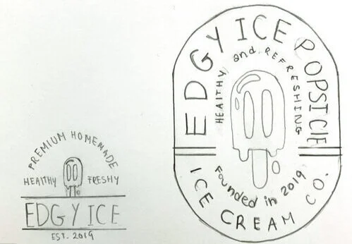
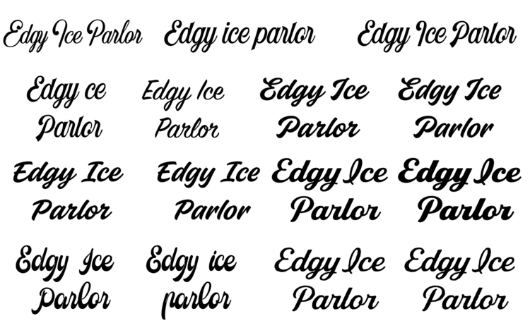
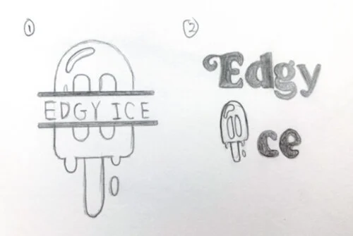
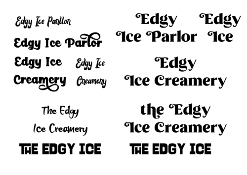
The initial design goal for Edy Ice was largely inspired by the combination of both modern and edgy art. The color palette and the style were also inspired by the Avant-garde art. One of the challenges that I had was creating the logo because the client wanted something new and innovative. At the end, I was able to create the logo with interesting edges instead of using rounded shapes. Their primary logo began with different variations of typography and iconography. While maintaining a consistent color palette inspired by the Avant-Gard movement.
Design Process
After creating the moodboard and research different ideas that would work best for the brand, I decided to create a modern and clean website. The primary logo for the brand had curvy illustrations that added a touch of playfulness while keeping the same straight lines for the popsicle.
The primary font for the brand was Eczar, the typeface provided an edgy and modern look. I used different weights show a visual hierarchy. I used Eczar and Archivo for the website and mobile app, and Airwaves and Bebas for the menu and the business cards. For the color palette, I used a classic pink, blue and yellow colors to create a modern and contemporary brand.
Logo Design
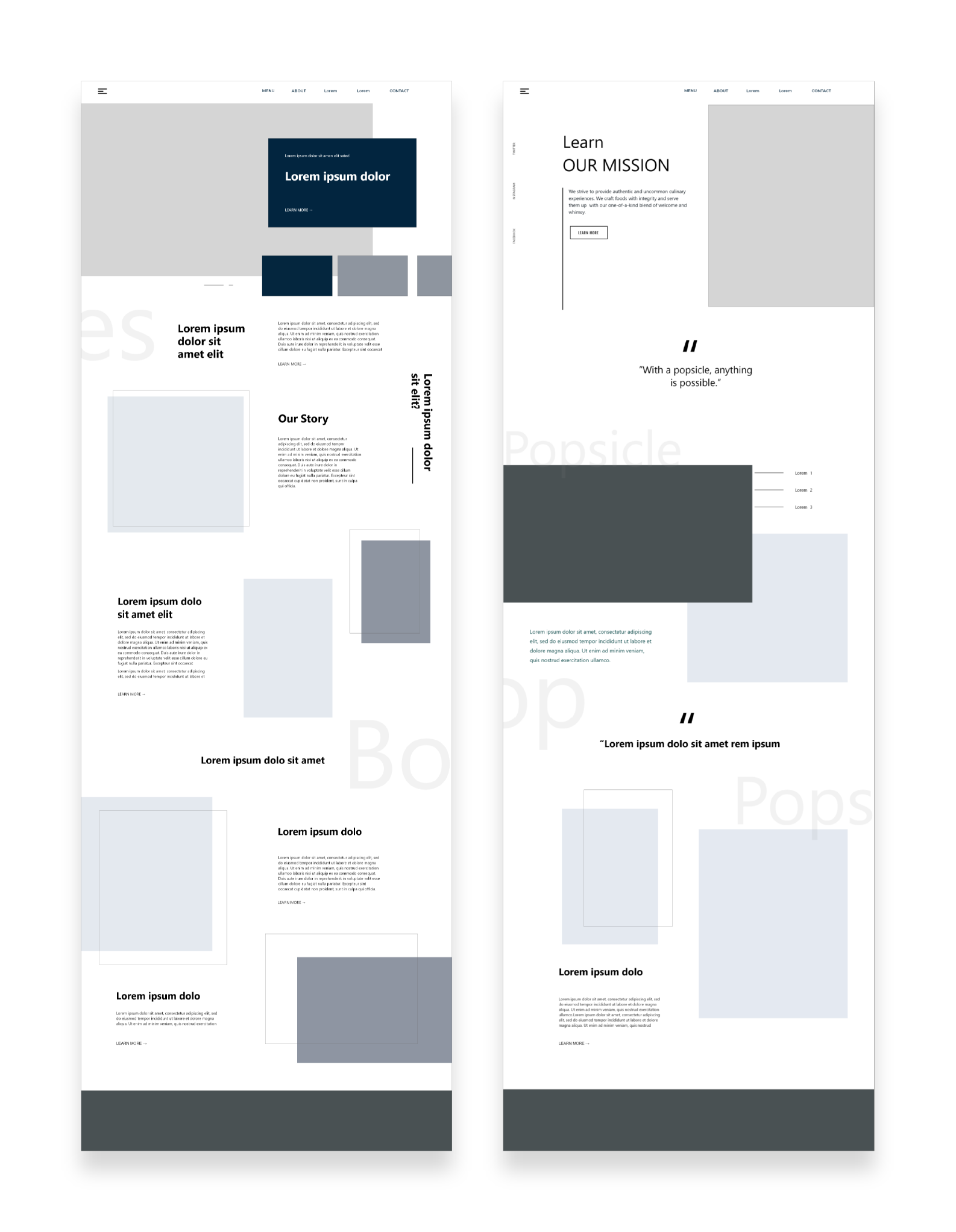
After creating the brand guide, I decided to start creating the wireframe, the client wanted 5 pages in their website. I created first the wireframe for the website, and then move to the mobile version. In that way, I was able to use the same content and style to keep the consistency.
Wireframe
After creating the brand guide, I decided to start creating the wireframe, the client wanted 5 pages in their website. I created first the wireframe for the website, and then move to the mobile version. In that way, I was able to use the same content and style to keep the consistency.
Final Design
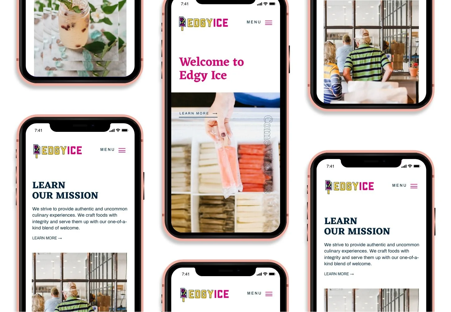
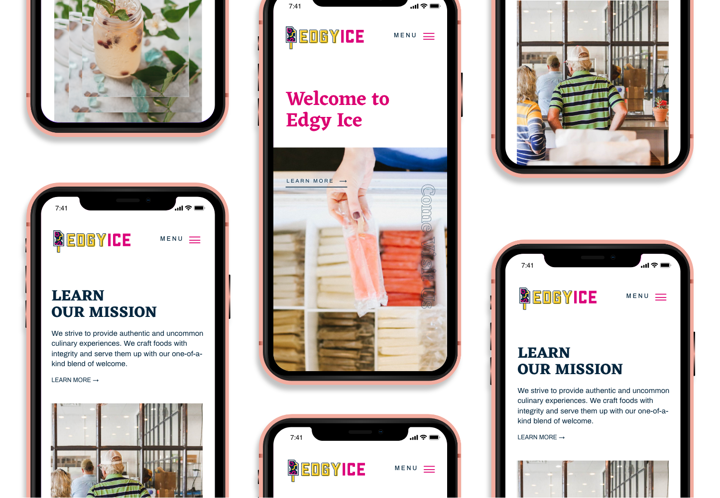
For the final product, I converted all the information collected into visual collateral which included a new color palette, logo, business cards, menu, packaging, and a responsive website and mobile application. We keep the main components of the brand that were a modern look, playful brand, and clean layout of both digital and traditional elements.




Mobile & Web Walk Through
The goal for the website was to create an easy to use platform for customers that were interested in the brand. It features bright white highlights and accent colors throughout the web page to invoke a clean and modern feel. I used color blocking and imagery so the customer can also see the playfulness side of the brand as well. The top of the website had a minimal content for easy access and use, with only the main logo and five page buttons. The Edgy Ice website features the different types of popsicles and services that our users can find in the website. Other brand elements were used to create a sense of hierarchy. Overall, we wanted users to be able to find the information quickly without the need of scrolling through long pages. These pages included are about, order, menu and a contact page.
For the mobile version of the website, I designed a responsive layout of the desktop version. The mobile version has the same features, but there are some elements that are stacking instead of next to each other. I made the pictures and text smaller in order to keep all the same content as the web version. The Edgy Ice mobile design also provides an easy menu to navigate all the key information of the company, as well as a menu tab, located on the top right corner. The mobile version also features color blocking and brand elements to separate content categories.
Edgy Ice Brand Guide
The combination of vivid colors to create Edgy Ice signature came from the idea of having a different and unique brand for a popsicle shop. The usage of pink and yellow helped create a playful and welcoming brand to draw users to get connected to the popsicle shop.
Key take away
I was able to explore different design styles. For me it was hard and challenging at the beginning because this was not my style, but I was able to learn the importance of trying different styles. Having a open mind help me grew as a designer and also helped me learn others ways that I could design without losing simplicity and elegance.

